Web Reporting has to be Responsive
What is Responsive Web Content?
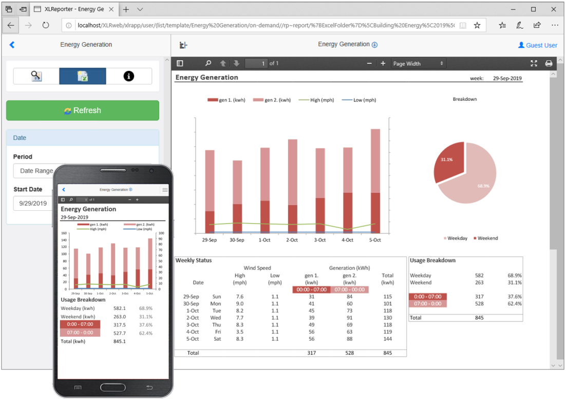
Have you ever wondered how the websites and apps you use always present the content in a way that looks good on both mobile and desktop displays? The sites and apps do this by detecting the type of device you’re using, and rearranging the content accordingly. Desktop displays have more screen “real estate” over which to spread out the content, and so the “large display” view fits more information on-screen at once. When a small display is detected, less information is displayed at once. Depending on the nature of the web content, the small display view may also contain a simplified version of the content. For example, with a process report that contains a large data table as well as a row of summary formulas such as minimums, maximums, or averages, the small display version of the report might show only the summary information.
Why Do We Do This?
Have you ever tried to open up an Excel spreadsheet on your mobile phone? With the default display settings for Excel’s workbooks, you’ll find that the content of the document is virtually impossible to see, let alone configure.
How is Responsiveness Implemented in XLReporter?
XLReporter contains pre-configured responsive report templates in its Template Library, and also allows users to design custom responsive templates by adding additional worksheets. The worksheets are formatted to fit a small (phone) or medium (tablet) display, and tagged with the display type in the sheet name. Then, when the reports are accessed from the XLReporter Web Client, the server recognizes the device being used, and displays only the content appropriate for that display size.
For more information on the web portal, Check out our website here.